40 Seconds - Reimagined
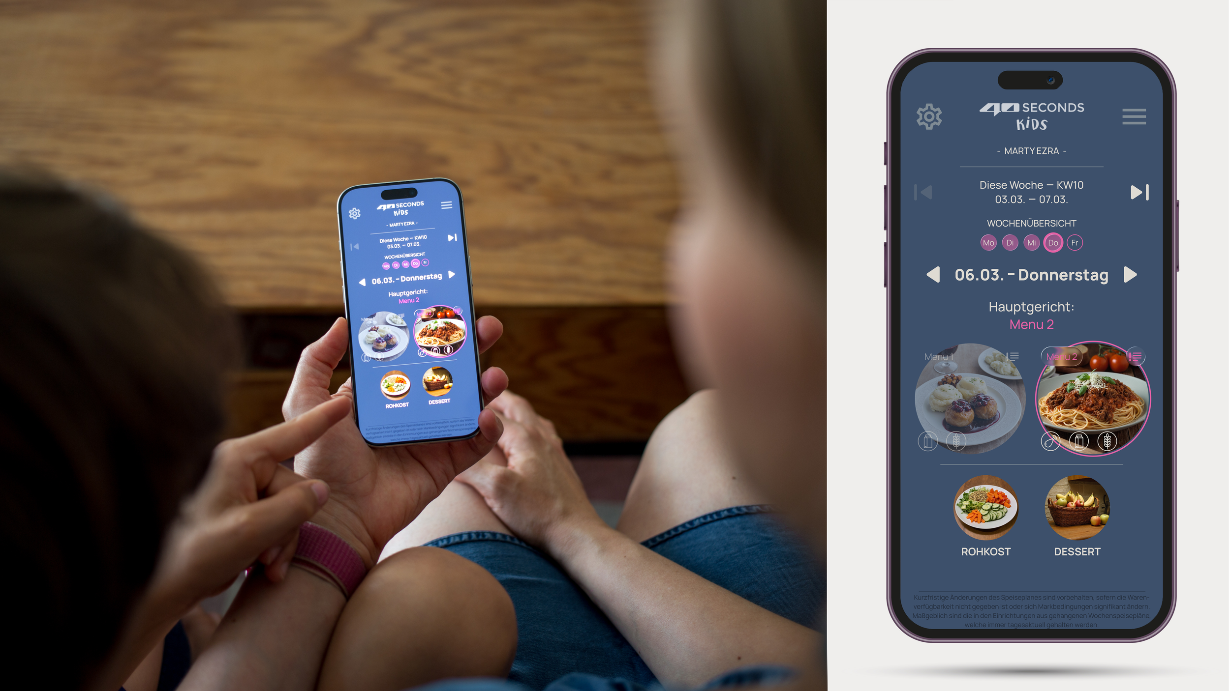
This self-initiated project reimagines the meal ordering experience for my children’s school. The existing system lacked a mobile-friendly interface, relied on text-heavy menus without food imagery, and presented information in a cluttered, non-intuitive way.
To demonstrate a more user-centered approach, I designed and prototyped a responsive web application as a high-fidelity click dummy covering one week of meal options. The concept features a modern, mobile-first interface, AI-generated food imagery created with Stable Diffusion, and a simplified user flow that makes choosing and ordering meals faster, clearer, and more engaging.
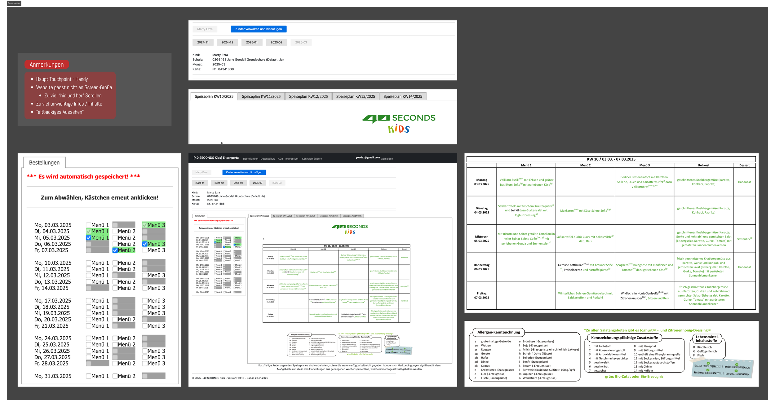
the Existing User Experience
The existing catering platform is poorly optimized for its primary touchpoint: the smartphone. The interface is not responsive, requiring users to zoom and scroll horizontally, while excessive vertical scrolling and unnecessary information make the ordering process more cumbersome than it needs to be. Combined with an outdated visual design, the overall experience falls short of modern usability standards.
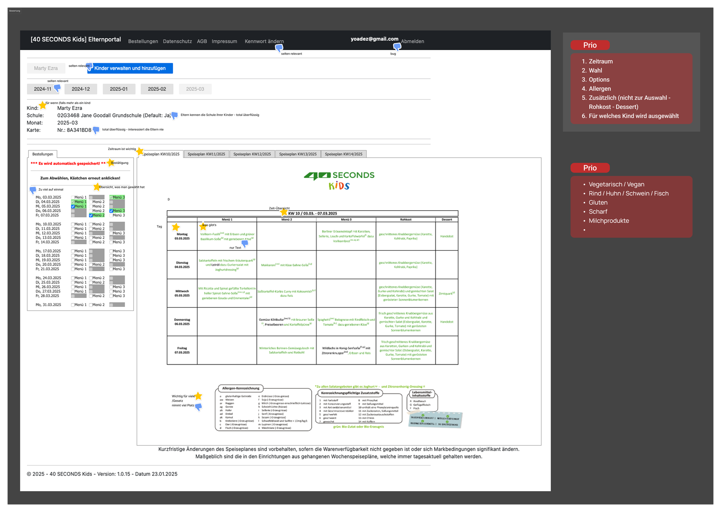
Information Assessment
The existing interface was evaluated by analyzing each piece of information according to its relevance to the user. Core content—such as the ordering period, meal options, selection status, and allergen information—was identified as essential for the ordering process, while redundant or low-value content was marked as secondary. This assessment established a clear understanding of what users actually need and highlighted where unnecessary information competes with important tasks.
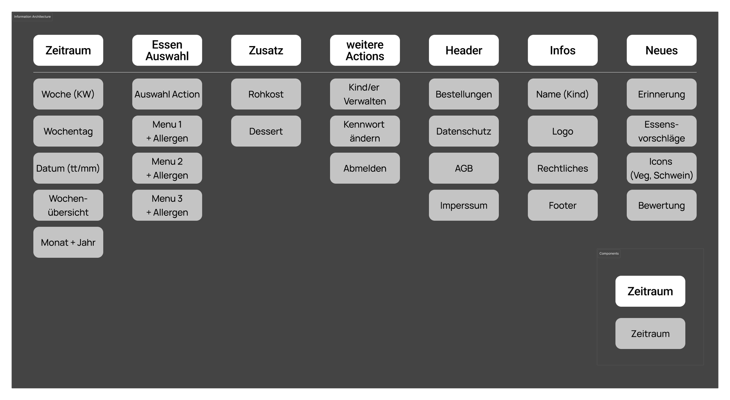
Information Architecture
Based on the information assessment, a clear information architecture was developed to define the structure of the application. The prioritized content was organized according to user needs and task flow, establishing the foundation for navigation, screen layouts, and content hierarchy before moving into interface design.
Wireframing
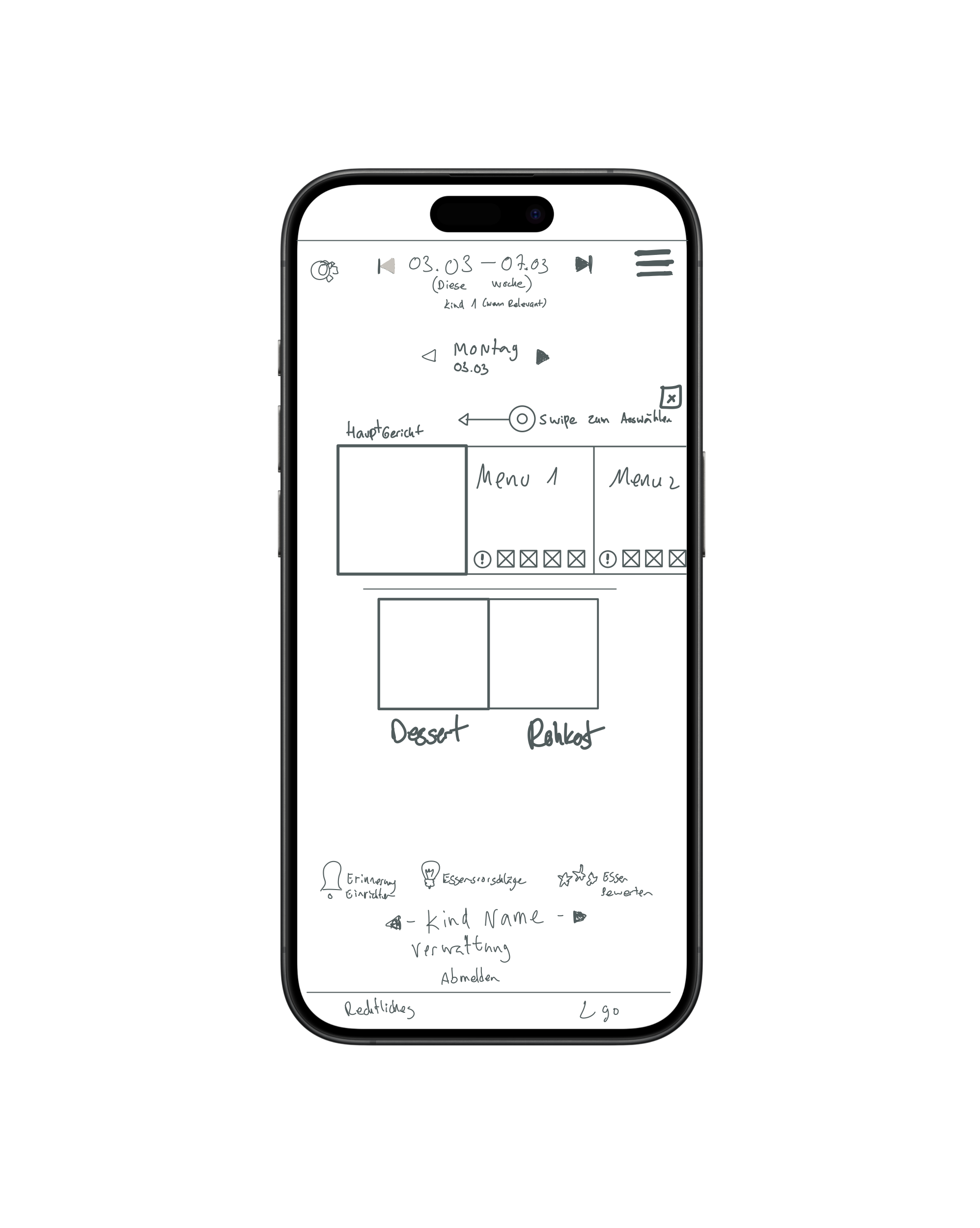
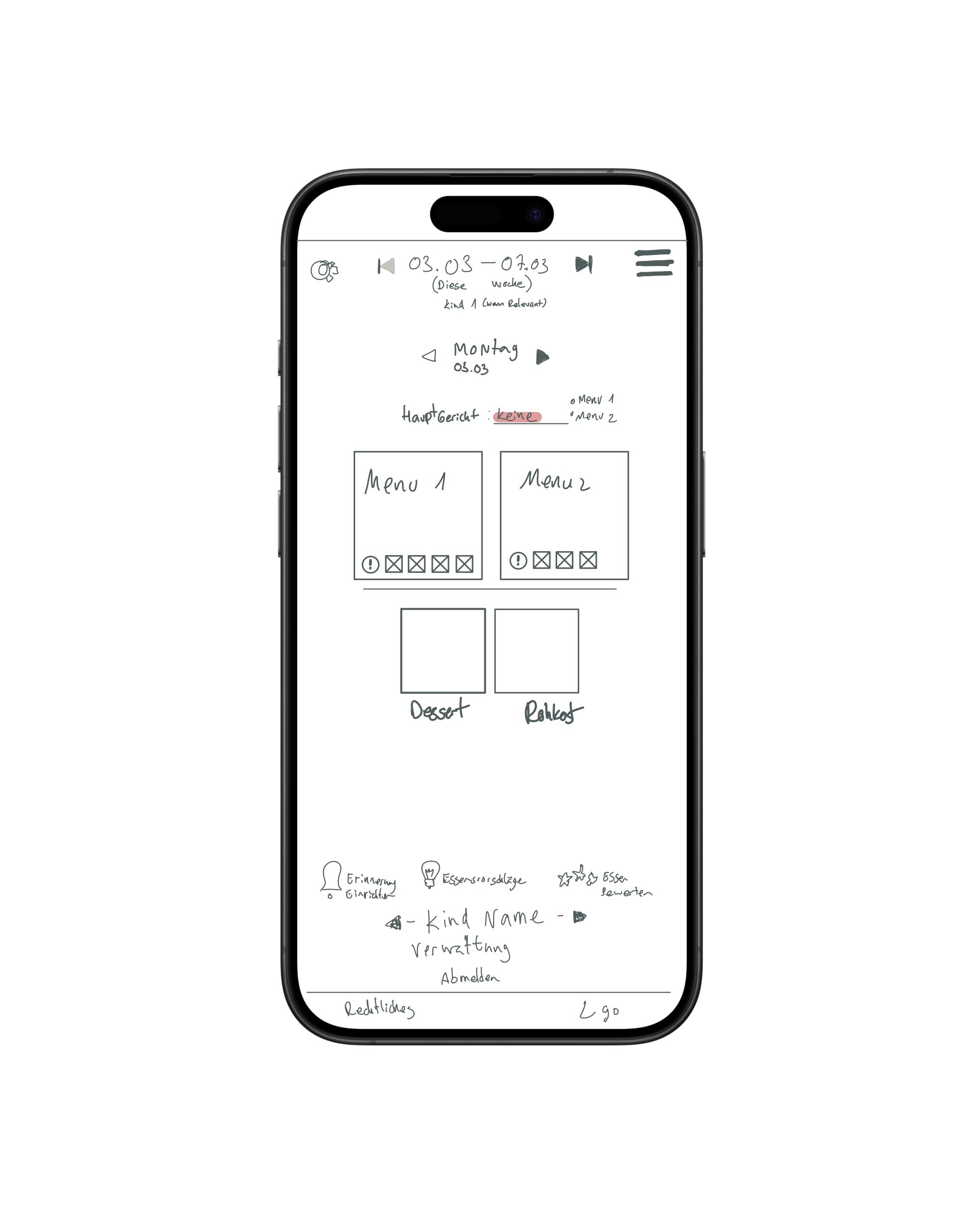
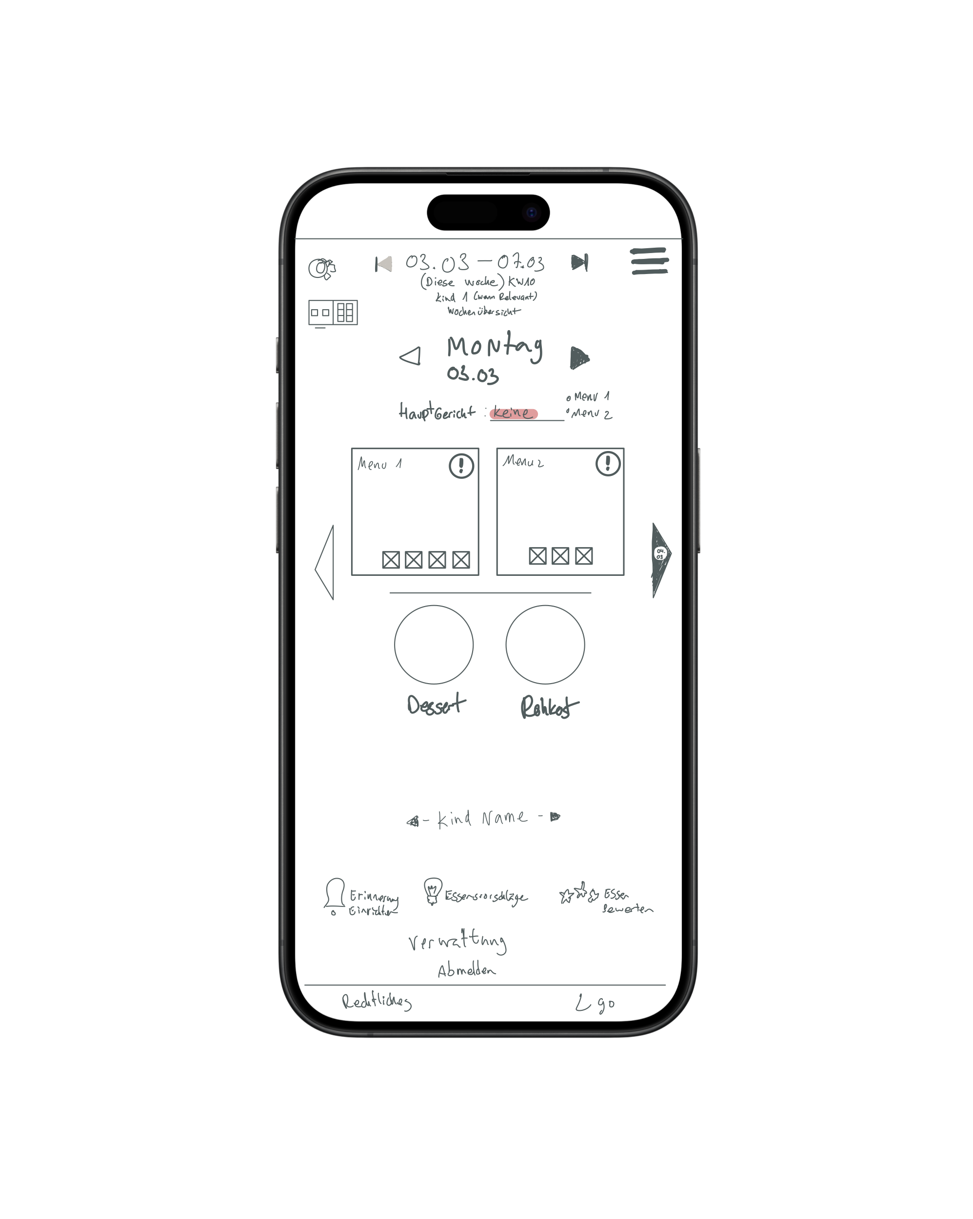
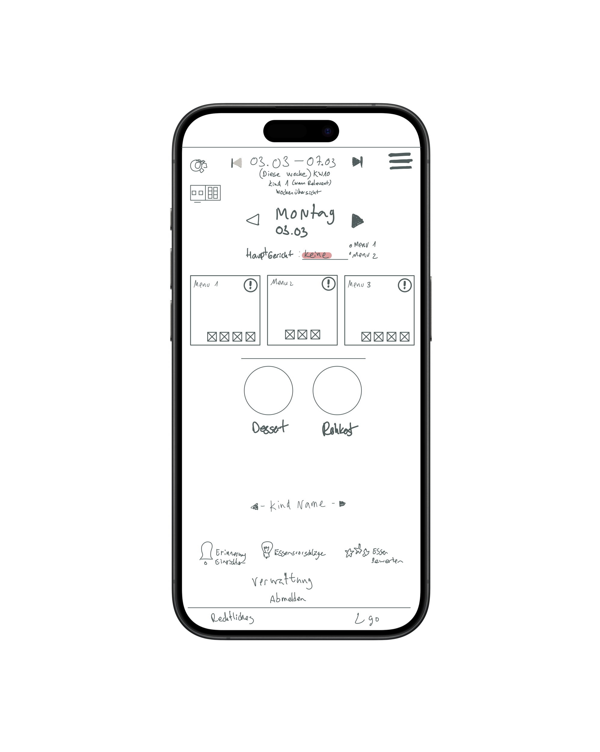
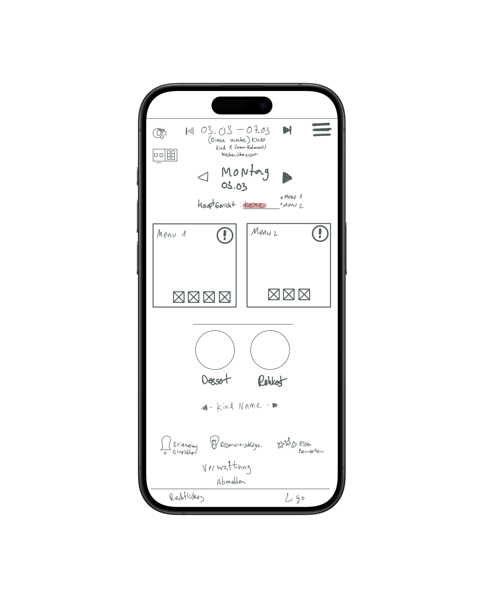
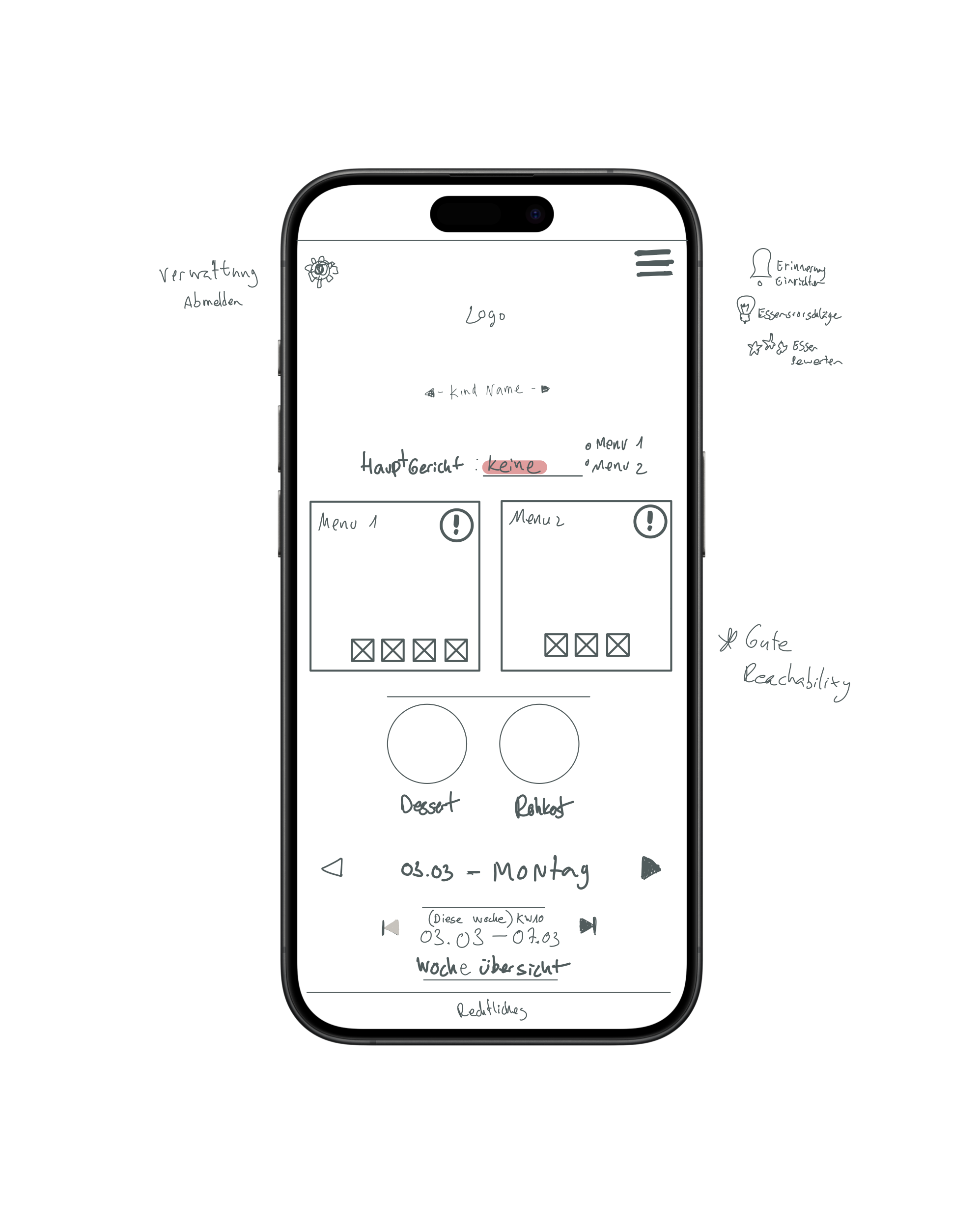
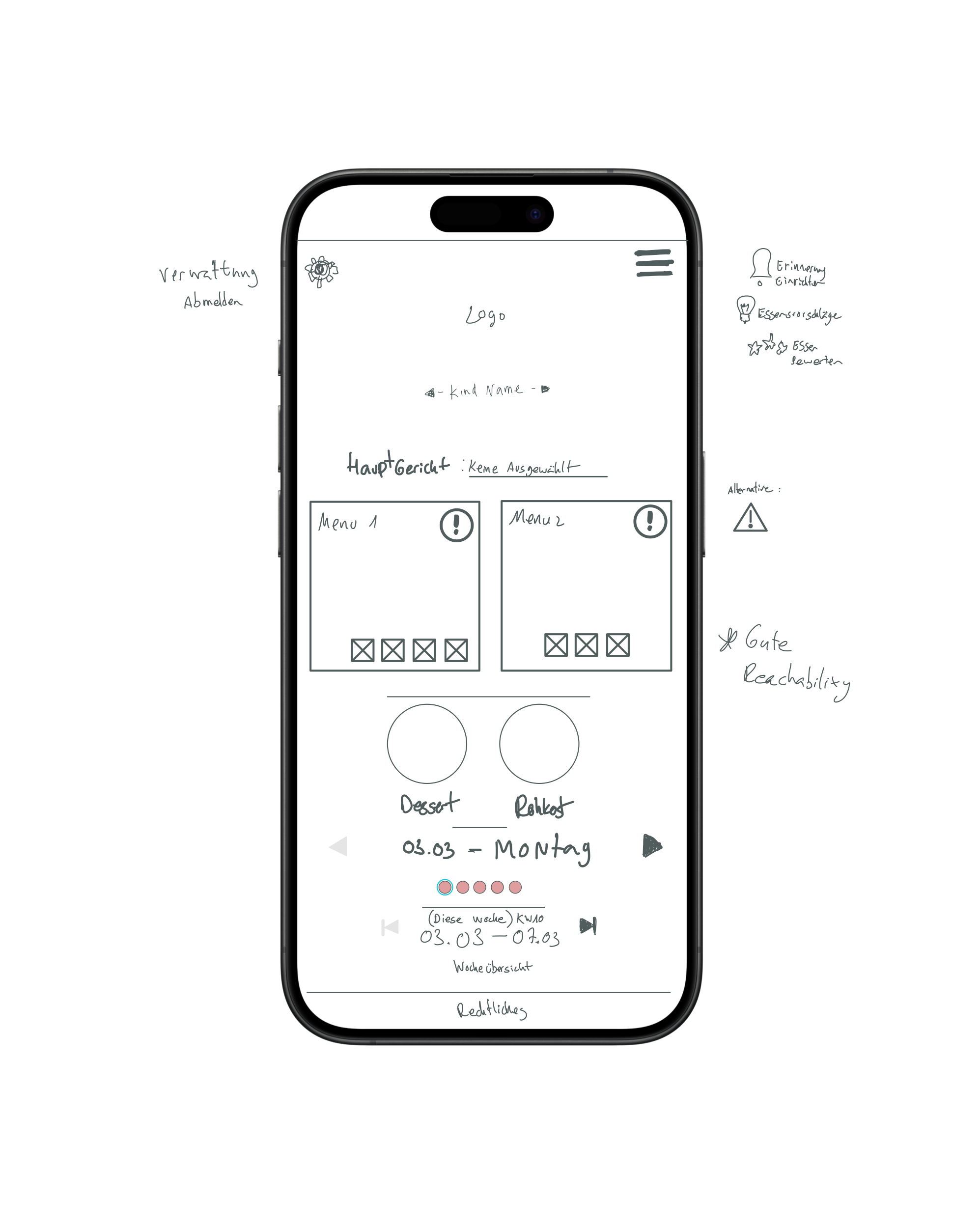
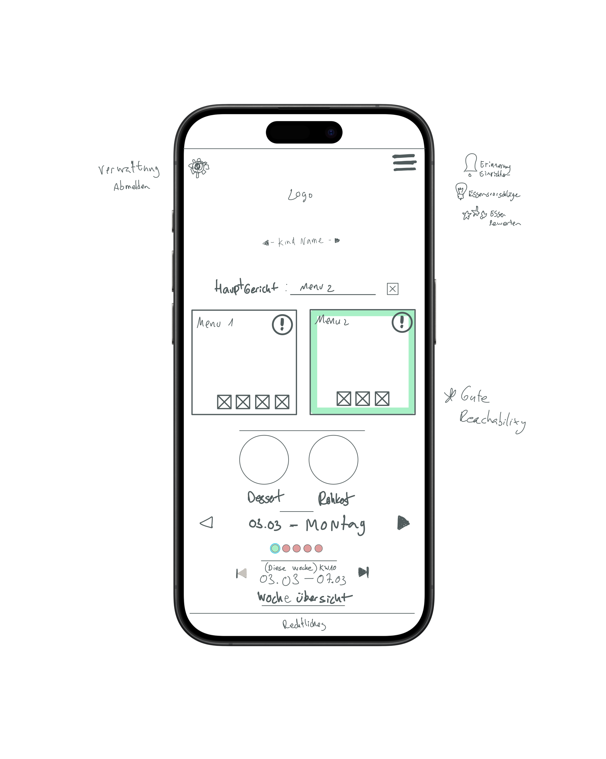
Low-fidelity wireframes were created to translate the information architecture into a functional interface. The focus was on validating layout, navigation, content hierarchy, and user flow before introducing visual design, ensuring that the core experience was intuitive and efficient. As the wireframes became more refined, they were used in static usability sessions with real users, allowing feedback to be incorporated early and helping shape the final wireframe before moving into visual design.
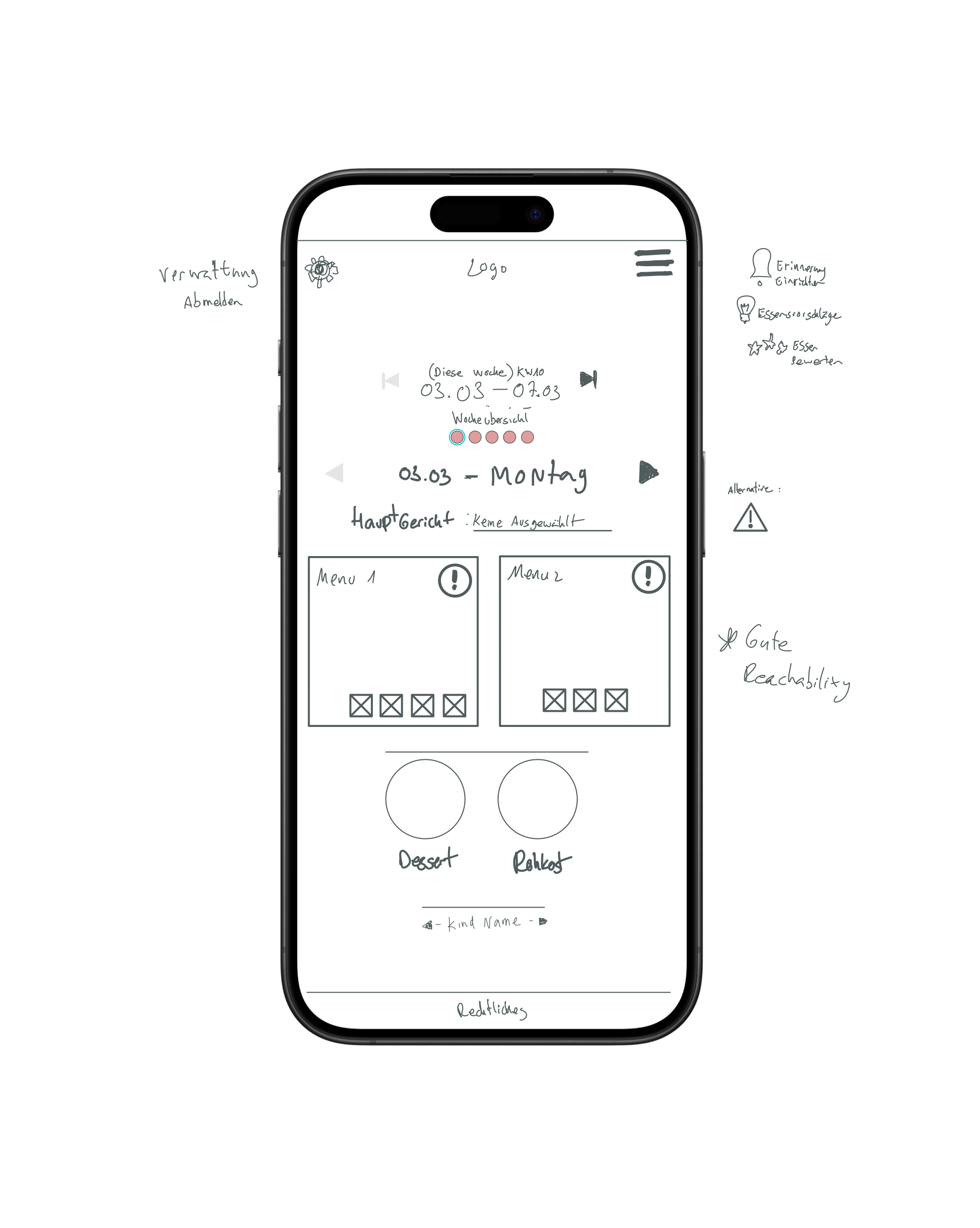
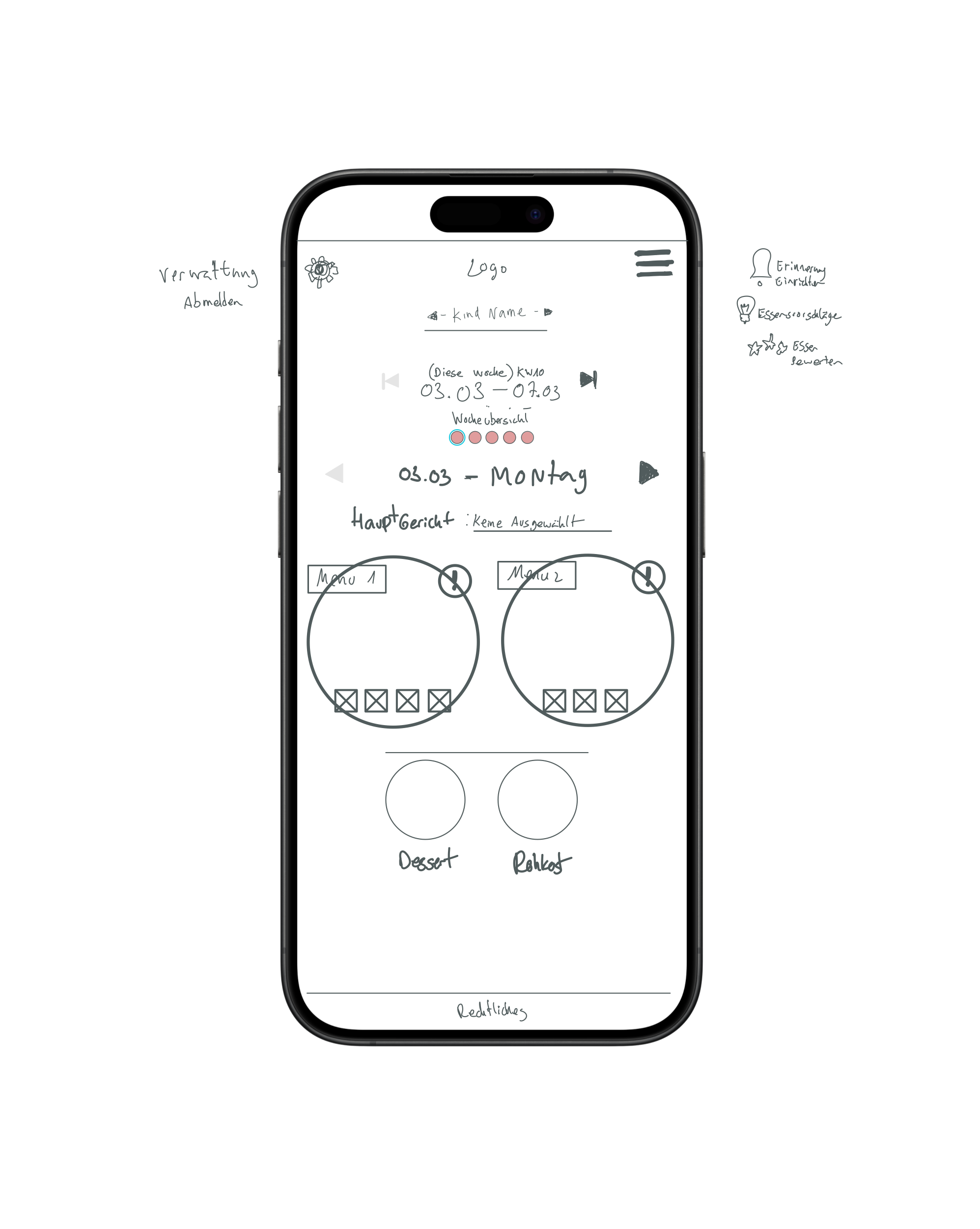
A picture is worth a thousand words
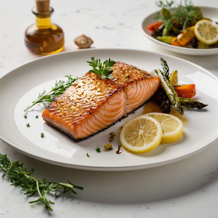
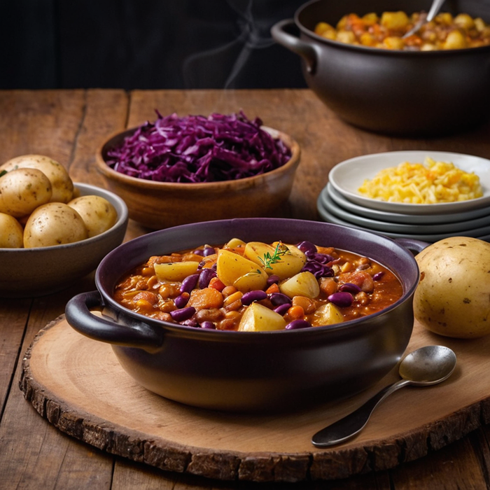
To create realistic visuals for each meal, the original German menu descriptions were first translated into English using ChatGPT. Based on these translations, detailed image prompts were generated and refined to accurately describe each dish. These prompts were then used in Stable Diffusion to produce realistic food imagery, giving the prototype a more engaging and informative user experience.
“Wildlachs in Honig-Senfsoße mit Zitronenknusper” → Wild salmon in honey-mustard sauce with a crispy lemon crust → A gourmet dish of wild salmon fillet glazed with honey-mustard sauce, topped with a crispy lemon-infused crust, served with a side of fresh herbs and roasted vegetables on a white ceramic plate.
“Winterliches Bohnen-Gemüsegulasch mit Salzkartoffeln und Rotkohl → Winter bean and vegetable goulash with boiled potatoes and red cabbage → A cozy winter dish featuring a steaming bowl of thick bean and vegetable goulash, paired with golden boiled potatoes and a side of braised red cabbage, served on a wooden farmhouse table.
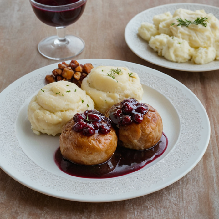
“Gemüse Köttbular mit brauner Soße, Preiselbeeren und Kartoffelpüree” → Vegetable Köttbullar with brown sauce, lingonberries, and mashed potatoes
→ A plate of golden-brown vegetable Köttbullar, drizzled with a rich brown sauce, accompanied by smooth mashed potatoes and a side of tangy lingonberry jam, presented in a Nordic-style dish.
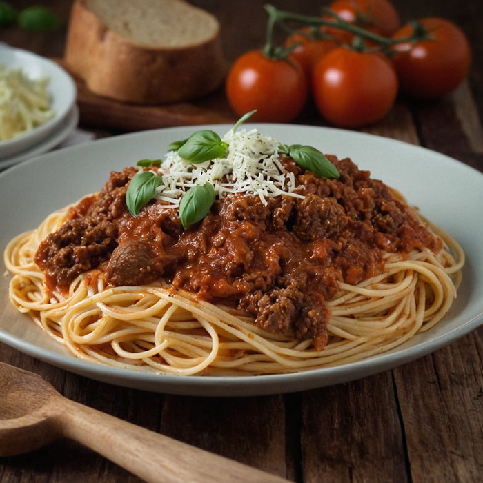
“Spaghetti Bolognese mit Rindfleusch und Tomate dazu geriebenen Käse” → Spaghetti Bolognese with beef and tomato sauce, topped with grated cheese
→ A hearty serving of spaghetti Bolognese, coated in a rich, slow-cooked tomato and beef sauce, topped with a generous sprinkling of grated cheese, served in a rustic Italian kitchen.
Typography
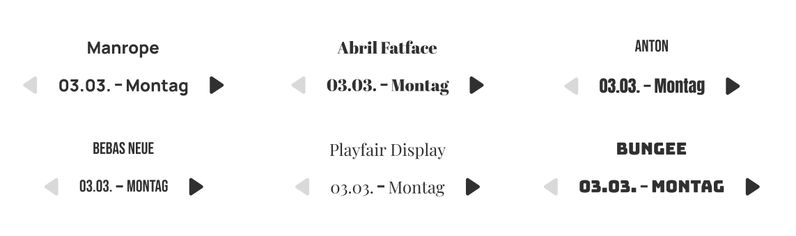
Several typefaces were evaluated for the interface, with Manrope ultimately selected for its excellent readability, clean geometric forms, and contemporary character. Its balanced appearance works well across different screen sizes, making it particularly suitable for a mobile-first application. While Anton and Abril Fatface offered strong visual personalities and were considered as alternatives, Manrope provided the best balance between clarity, friendliness, and usability—allowing the food imagery and content to remain the primary focus.
Interface Design and color exploration
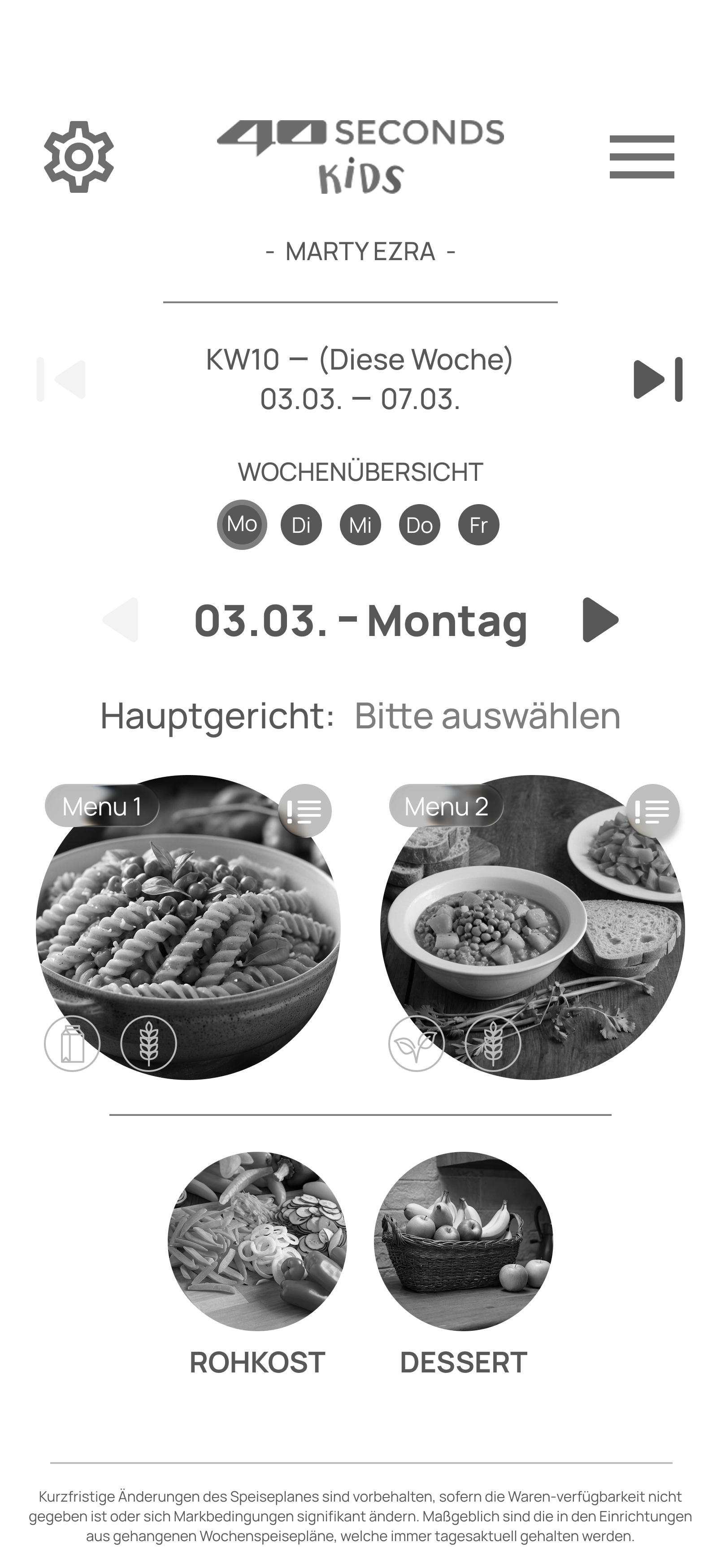
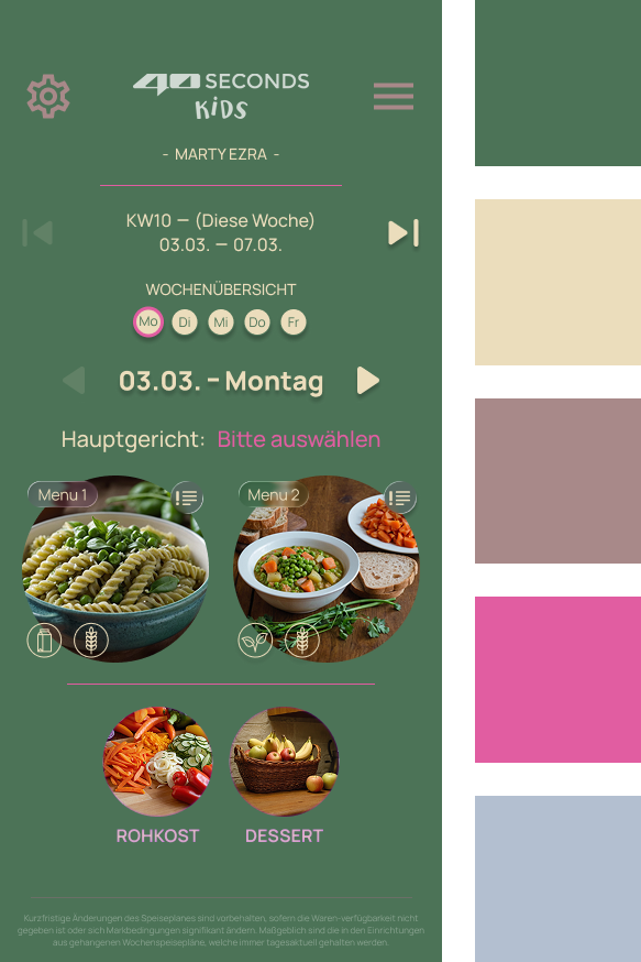
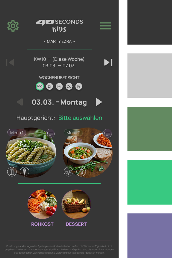
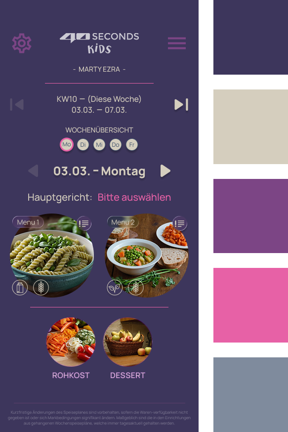
The wireframes, information architecture, typography, and AI-generated food imagery formed the foundation of the interface design. Before introducing color, the layout was refined in grayscale to establish a clear visual hierarchy, balanced spacing, and intuitive navigation. This ensured that usability and content organization were validated independently of visual styling. Once the structure was finalized, different color palettes were explored to define the application’s visual identity and create a warm, inviting look that complements the food-focused experience.
Bringing It All Together
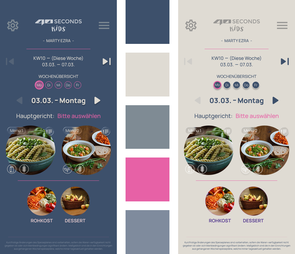
The final interface brings together the project’s information architecture, wireframes, typography, and AI-generated food imagery into a cohesive, mobile-first experience. After exploring multiple visual directions, a color palette of muted blue (#3D506B), warm beige (#DFDBD3), and vibrant pink accents (#E761A6) was selected to create a calm, approachable, and contemporary look. The same design system was then adapted into both light and dark themes, resulting in a consistent, accessible interface that feels modern, intuitive, and enjoyable to use.
Component System
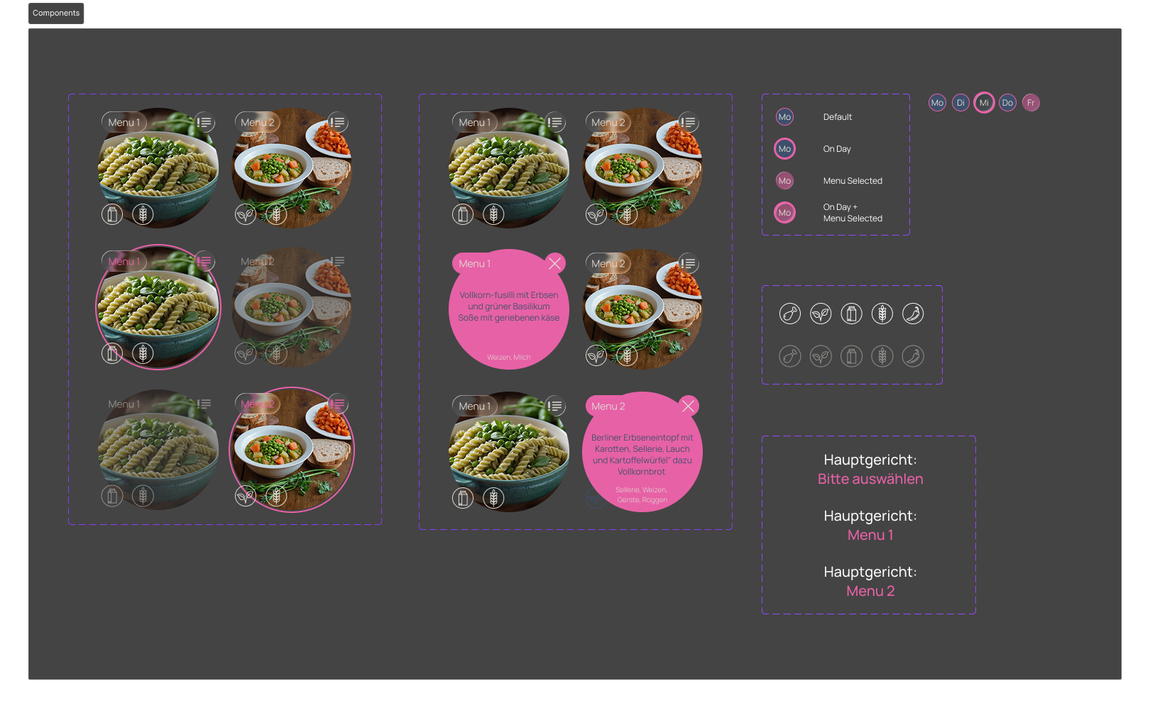
To streamline the design process and ensure consistency across the interface, a reusable component library was created to enable faster iteration, easier maintenance, and a consistent user experience throughout the prototype.
Interactive Prototype
To validate the final concept, the interface was developed as a high-fidelity interactive prototype (click dummy). Simulating a full week of meal options, it allowed the complete ordering flow to be tested and experienced in a realistic context. The prototype served as a tool to evaluate navigation, interaction patterns, and overall usability before any implementation, demonstrating how the redesigned experience would perform in everyday use.